Presto Dashboard Redesign
Redesigning Presto’s analytics dashboard to make data visualization clearer, faster, and more actionable for business users.
Core Problem
Business users were ignoring most of the dashboard, not because the data was wrong, but because the layout made no distinction between data that drives decisions and data that merely exists
Role & Scope
UX/UI Designer: user research with business stakeholders, metric prioritisation framework, information hierarchy redesign, and high-fidelity UI for the primary and secondary dashboard views
The Challenge
UX/UI Designer: user research with business stakeholders, metric prioritisation framework, information hierarchy redesign, and high-fidelity UI for the primary and secondary dashboard views
Reflections
This project was an invaluable opportunity to apply UX/UI design principles in a real-world setting, contributing to a product that promotes social connectivity and culinary exploration. It challenged me to think creatively about how to meet user needs and preferences, enhancing my skills in research, design, and collaboration. The experience underscored the importance of user feedback in the design process and the impact of thoughtful design on user engagement and satisfaction.

Other projects
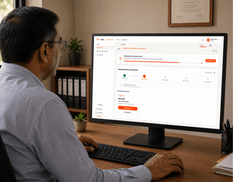
DRAS Assessment Portal for MSMEs
How do you digitize a government evaluation process when your users have never filled a form online and the entire system runs on WhatsApp forwards and printed sheets?

Logsy: Tracking Growth Through Play
Parents want to track their child's development. Children want to play. How do you design one product that genuinely serves both, without turning learning into a chore or play into a test?
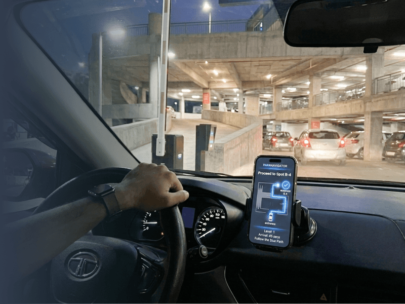
A Predictive AI & Automation Ecosystem Design
Hyderabad drivers waste 20+ minutes per trip searching for parking. When you build an AI that predicts availability, the real design problem isn't the algorithm, it's whether users will trust a prediction they can't verify.

Trust and Explainable AI (XAI) in E-Commerce
Indian fashion shoppers abandon carts at high rates even when they like the product. The question wasn't "how do we show recommendations", it was "why don't users trust what the algorithm is showing them, and what would actually change that?"
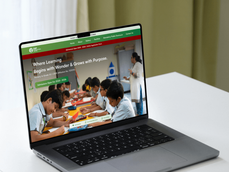
Reimagining a School’s Digital Identity
A school's website is its first handshake with an anxious parent. When navigation is built for internal logic instead of parent intent, the result is a beautiful site that nobody converts on.